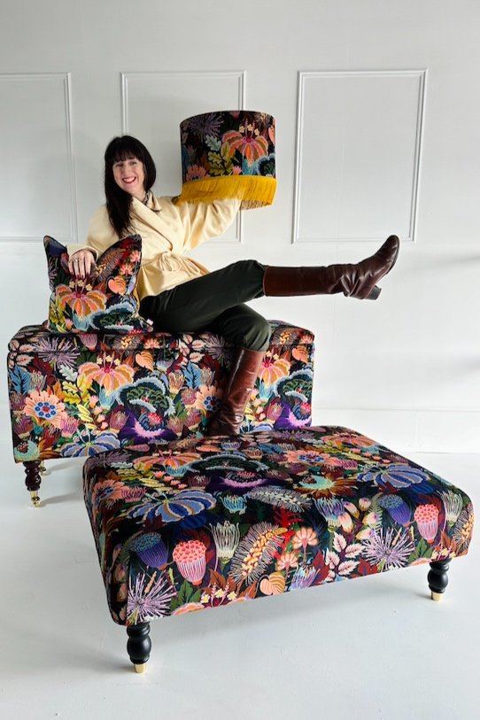
Studio Coverdale X Sparrow & Plumb
We are SO excited to finally be able to talk about our brand new collection in collaboration with the fabulous Studio Coverdale! Our 5 piece furniture and home furnishing collection went live on the 29th of February and it has been a crazy journey since we started working on this project in 2023. There is so much we want to share with you about the experience, including behind the scenes of making and photographing our products, but I will start at the beginning…
Natasha Coverdale is one our all time favourite artists between us girls at S&P and to have collaborated with her on this collection launch has been a dream! Collectively, myself Alice and Molly (the S&P gals!) had been growing our Studio Coverdale print collection in our homes and admiring Natasha’s work from afar when she approached us with the proposal of launching a furniture collection in her brand new fabrics! If you’re not already aware of Natasha’s work, you can check out her incredible talent here. Studio Coverdale is the hub of all things colour and glorious pattern - immerse yourself with a range of stunning Posters, Giclees and Accessories inspired by 17th Century French Textiles and Japanese Wood Block Prints.
Enter a world of colour and floral fantasy by discovering the full collection here!
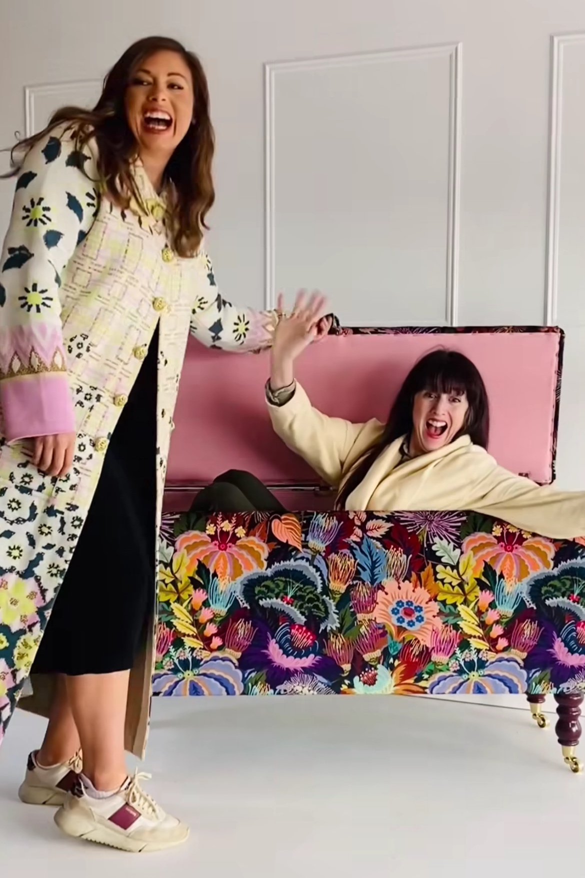
Team Sparrow & Plumb and Studio Coverdale (Natasha, back right) with the new collection!
1. The Vision for The Collection
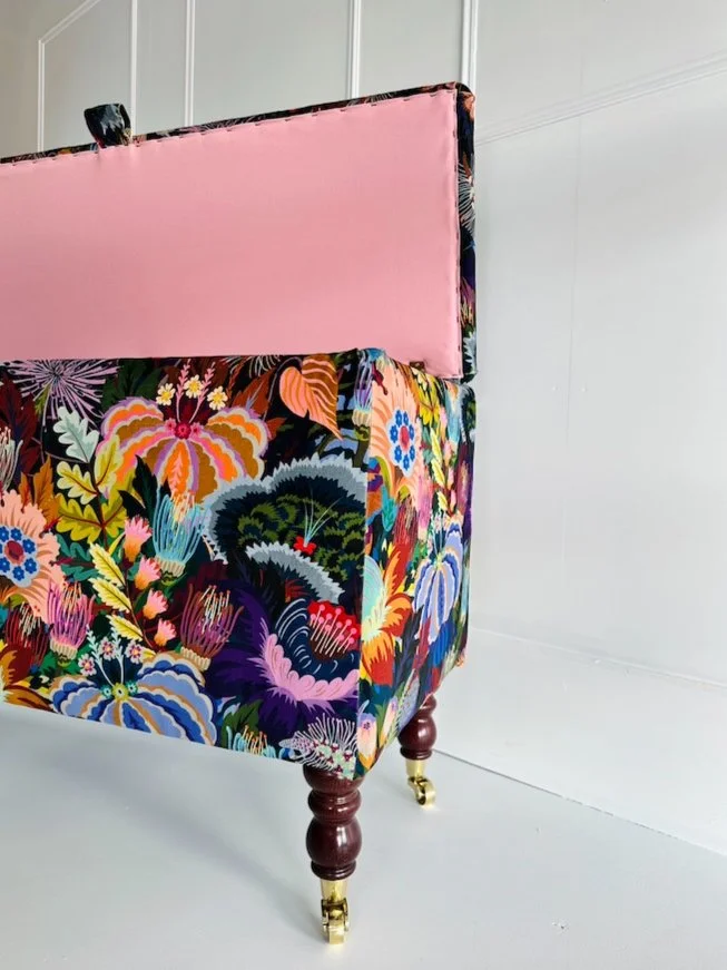
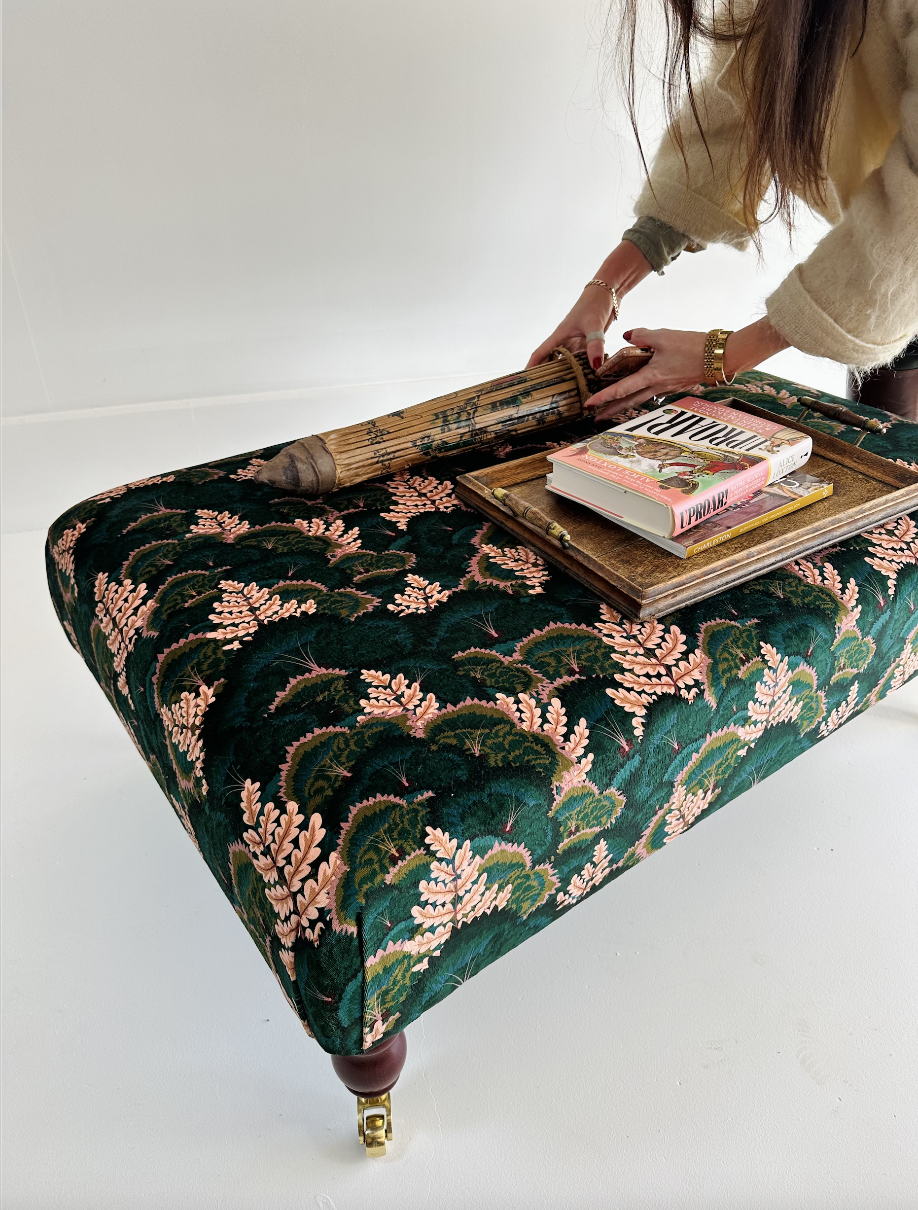
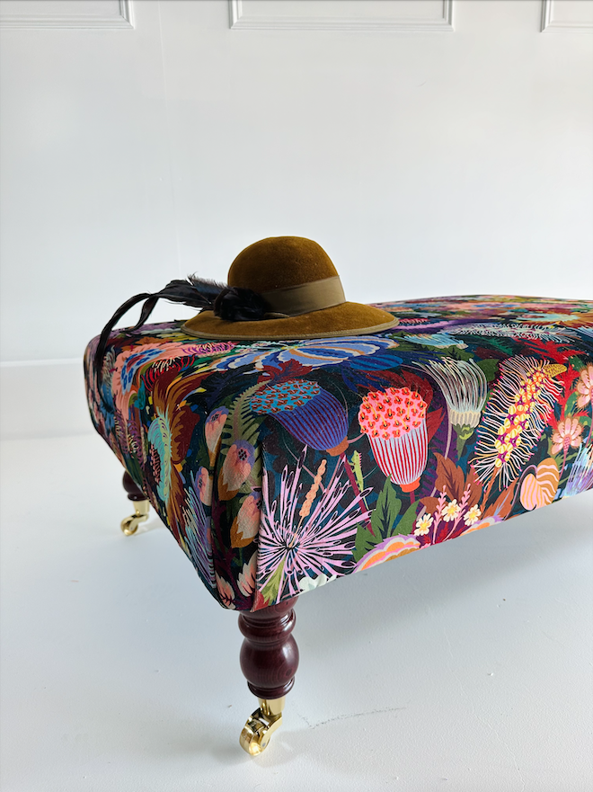
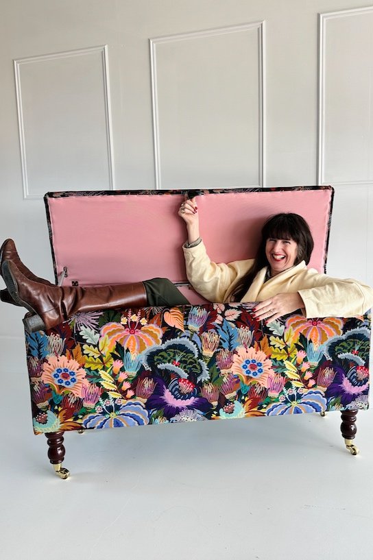
We knew we wanted this collection to be luxurious, whilst also keeping the products affordable for our customers. Each stage was carefully thought out to ensure we never compromised on quality. It was also important to us that we connected our products to Natasha’s brand identity, therefore we chose a gorgeous pale pink cotton for the lining of the Ottoman, a colour that is significant in Natasha’s branding. We chose Premium Turned Legs for our Ottoman and Coffee Table Footstools, Natasha is a lover of antique wooden treasures and mahogany furniture - so the mahogany finish on the legs was the perfect touch!
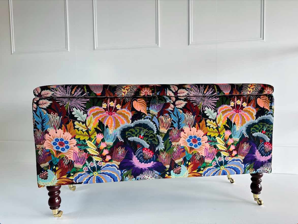
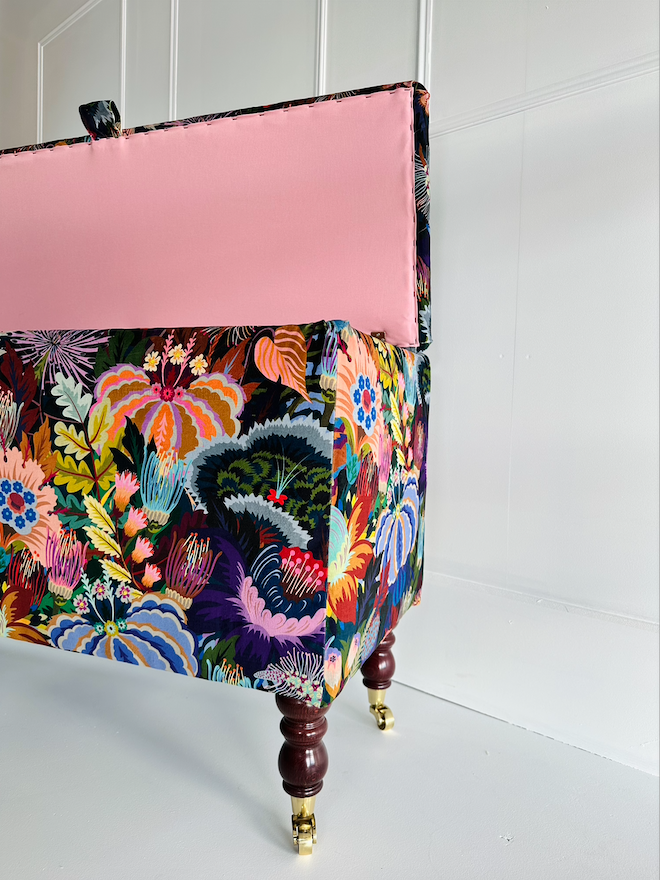
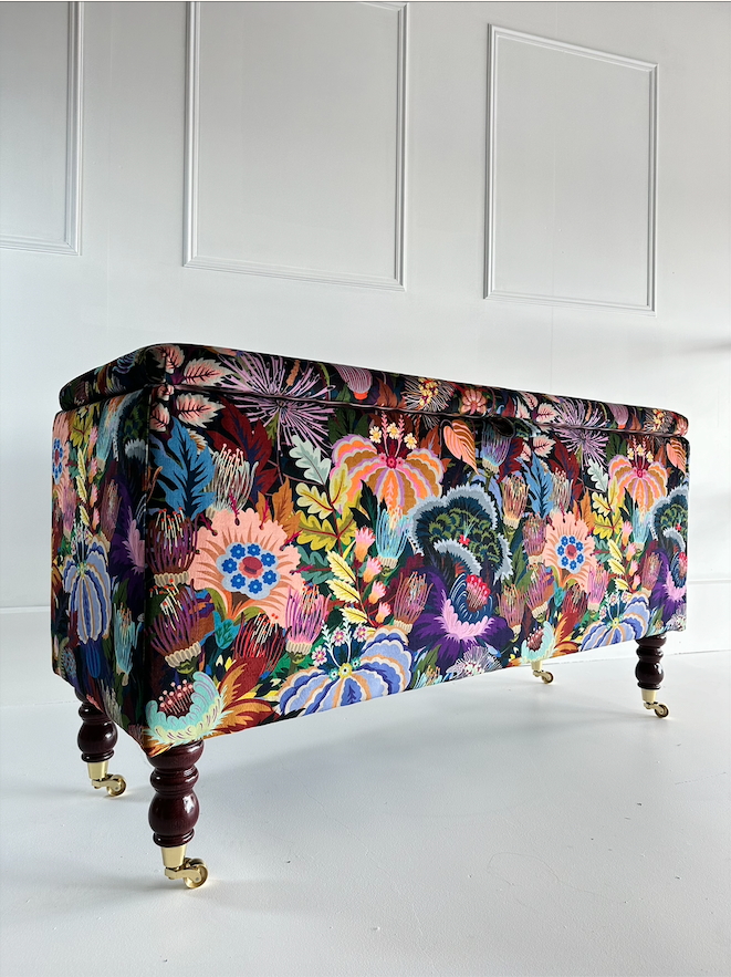
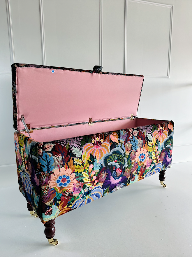
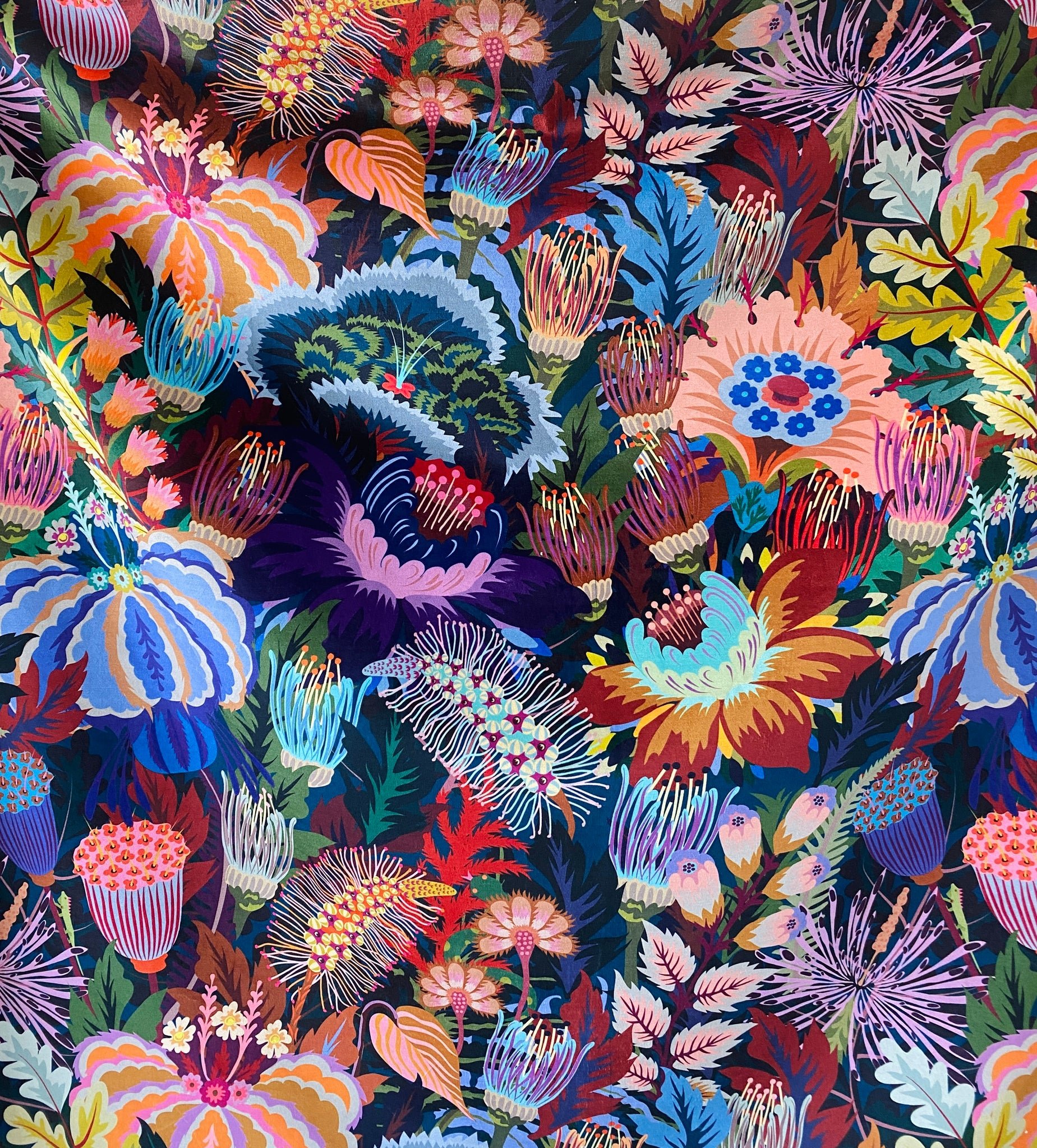
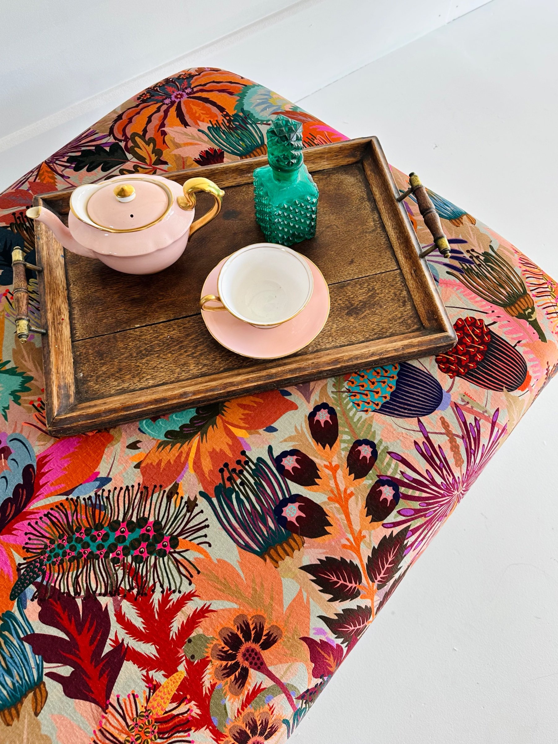
Introducing our stunning collaboration with the wonderfully talented Studio Coverdale! Pictured is the Mars Meadow Evergreen design. Please select from 4 different Studio Coverdale fabrics below.
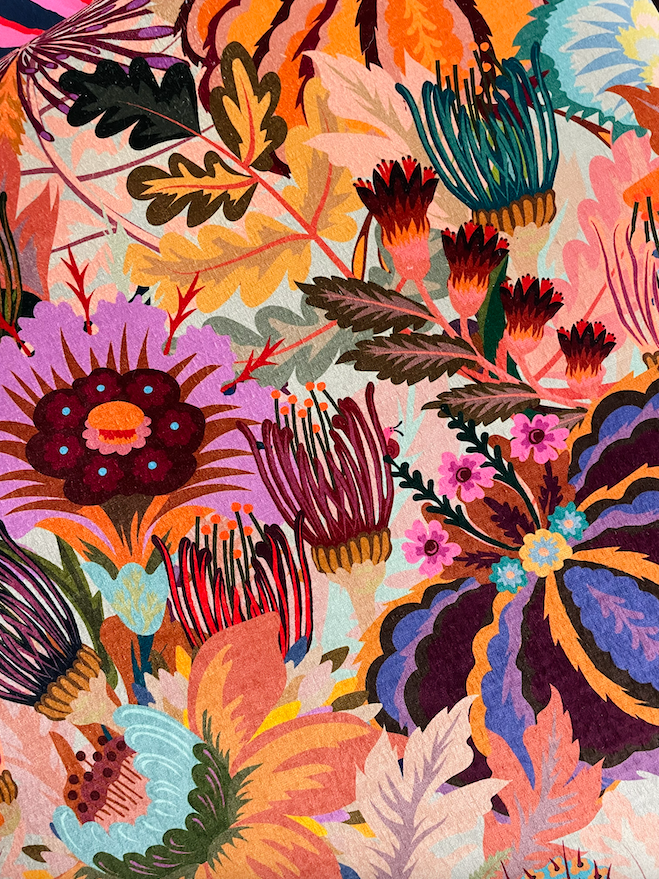
Our fabulous new luxury Ottoman in Studio Coverdale Recycled Velvet not only offers practicality, but also provides a stylish statement to liven up your interiors. Electric Poppies, Balloon Flowers and Firework Lilies bustle and bloom together in this signature Coverdale print. Rich jewel tones will add impact to any room! With Derek the tiny punk iguana, Sally snail and Cyril snake all hidden within the design...
Handcrafted in our Somerset workshop and made with love by our small team. These ottomans are made using quality materials and are strong enough to use as additional seating. Complete with a gorgeous pink interior for added elegance!
Created with beautiful turned castor legs available in 2 finishes: Mahogany or Oak.
Ottoman Dimensions: H 58cm x L 125cm x W 45cm
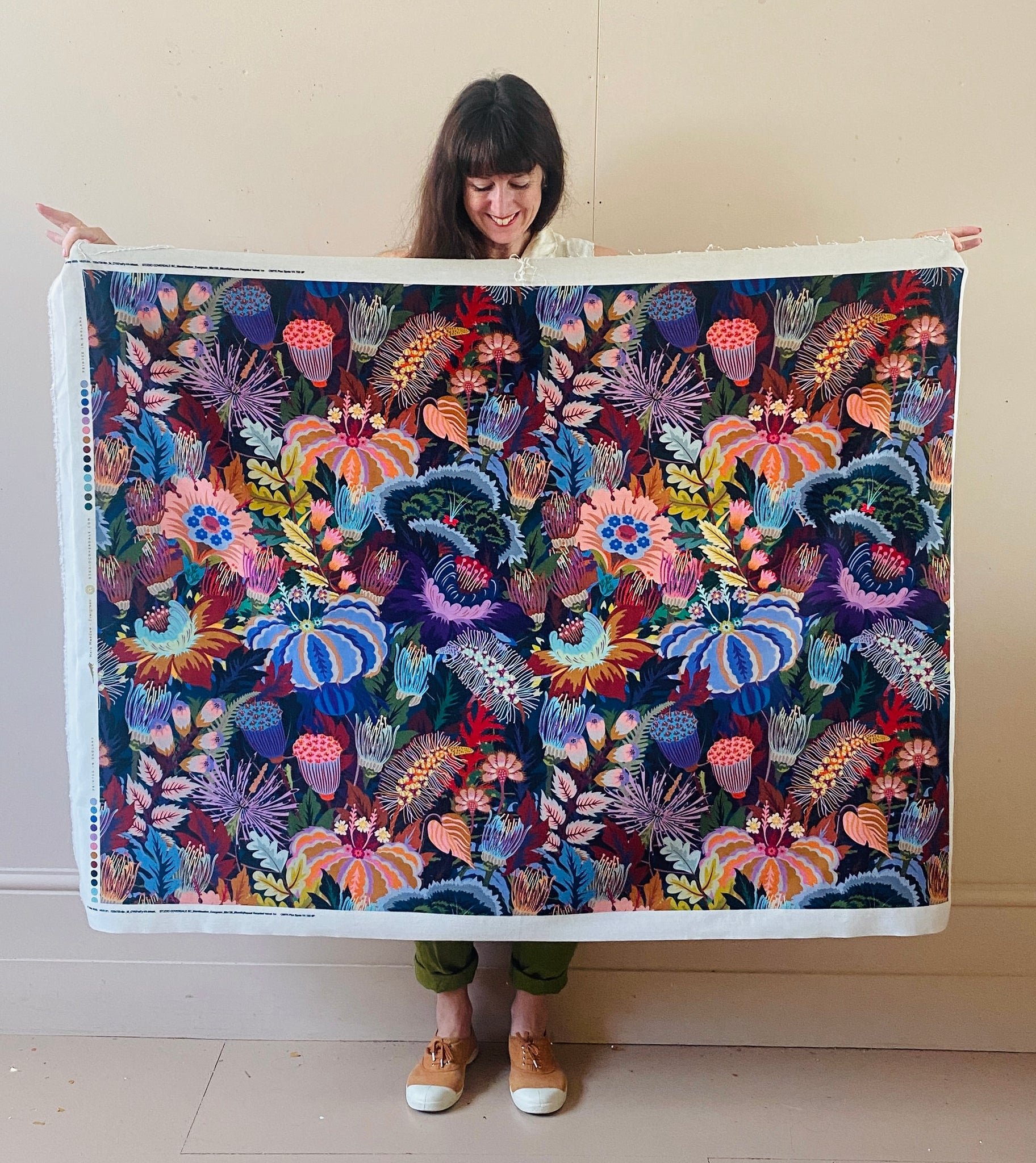
Fabric Details: Recycled Velvet
Beautiful rich colours and luxurious feel, most sumptuous. Pile made from Recycled plastic bottles and post consumer waste
Composition: 67% Recycled PES / 33% PES
Care: Professional Cleaning Only
Hand sprayed with fabric protection for stain prevention.
International Customers: please email info@sparrowandplumb.com along with your full delivery address and we will be able to provide you with a delivery quote.
Delivery: Our Studio Coverdale furniture is made to order, please allow 6 weeks for make, orders are then placed on an express delivery service. As soon as your order is ready, we will notify you via Email along with your tracking information.
TERMS & CONDITIONS -
We do not offer refunds/returns on any of our handcrafted furniture. The onus is on the customer to make sure that the measurements and the fabric will fit and of course suit your interior space.
As mentioned above if you have any queries regarding the fabric or dimensions, please do not hesitate to contact us and we will be happy to help.
As we are a small UK business creating made to order items, we can not accept returns unless the items have been damaged in transit if reported immediately or in anyway deemed faulty.
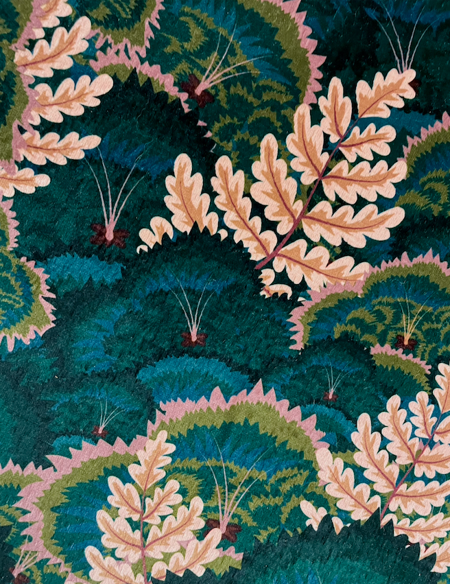
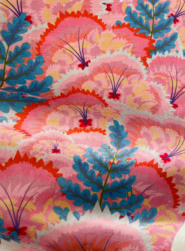
Natasha has an existing wallpaper collection in collaboration with Lick (which is SO gorgeous and you can check it out here!), it was a dream of hers to release the wallpaper designs as fabrics that could eventually be made into furniture. Natasha did lots of research before finding the perfect printing mill for the job, a company based in England who are passionate about sustainability. Shop the fabric swatches here and start planning your next interior project!
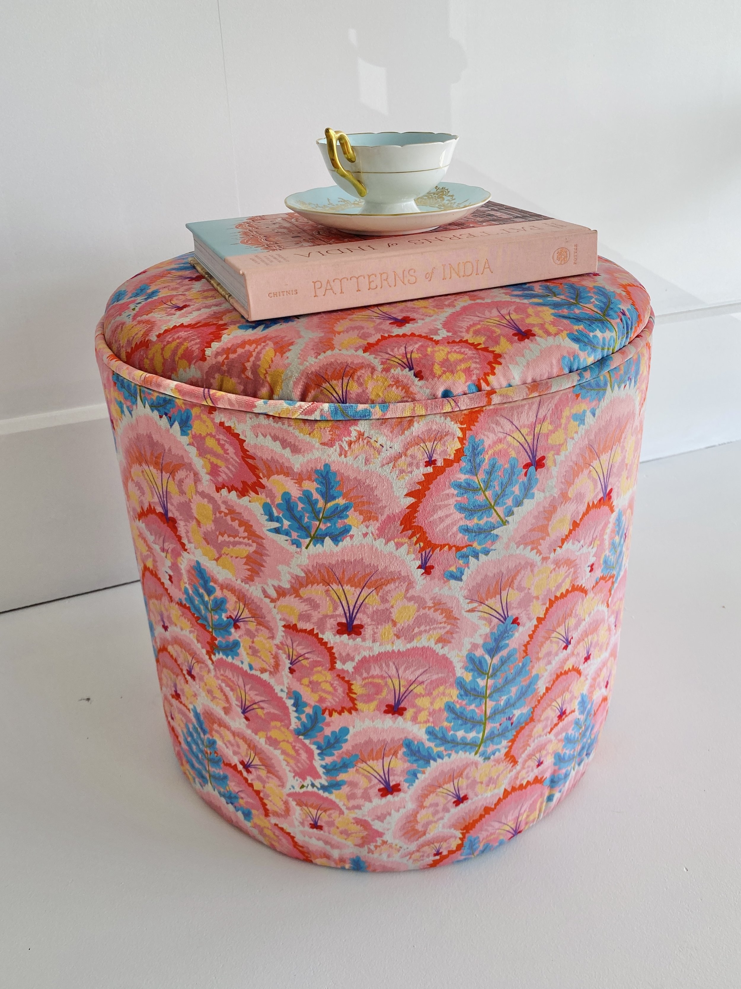
The ambition was to create a collection that would compliment her stunning wallpapers and help to tie people’s interiors together. We love the possibilities this collection creates when combined with the wallpapers, allowing peoples to go wild with colour and pattern. Encouraging pattern mixing for maximum impact, or for a more cohesive look, our customers will be able to bring in matching elements to their wallpaper- whether that is with a statement ottoman or through smaller touches with the lampshade and scatter cushion.
2. The Making
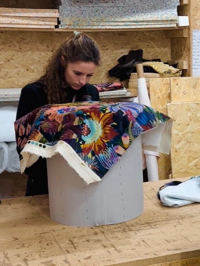
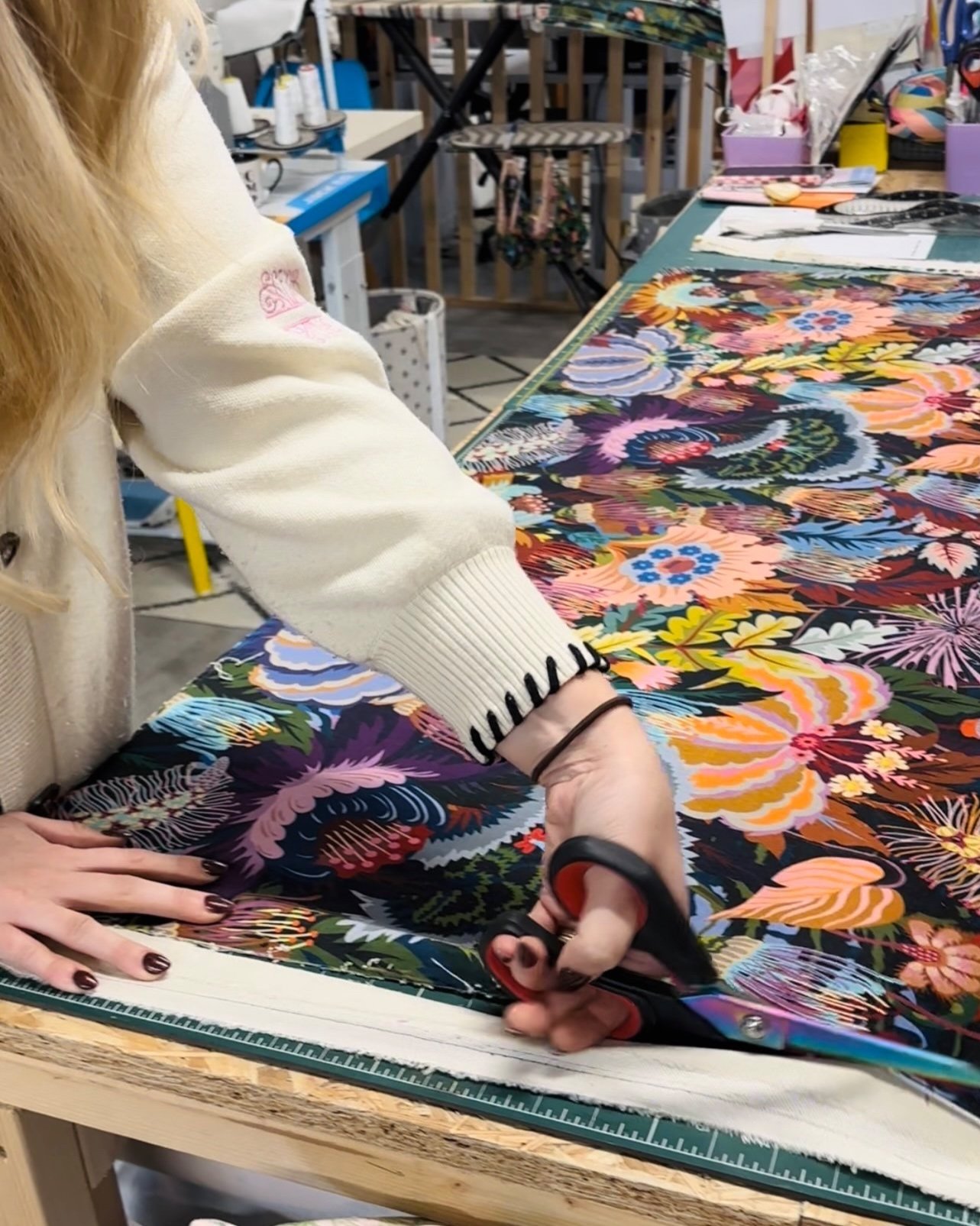
Both Sparrow & Plumb and Studio Coverdale are passionate about reducing our impact on the environment, so each stage of the make has been carefully considered; from the recycled foam used to cushion our furniture, to the beautiful velvet fabric which is a product of post- consumer waste. We are collectively passionate about women supporting women and the importance of supporting small businesses, so all in all, it really was the dream collaboration!
At Sparrow & Plumb, we do our bit to reduce waste through our made to order business model. We only order in the materials required to complete the orders, this includes the fabric which we order in small quantities to prevent waste.
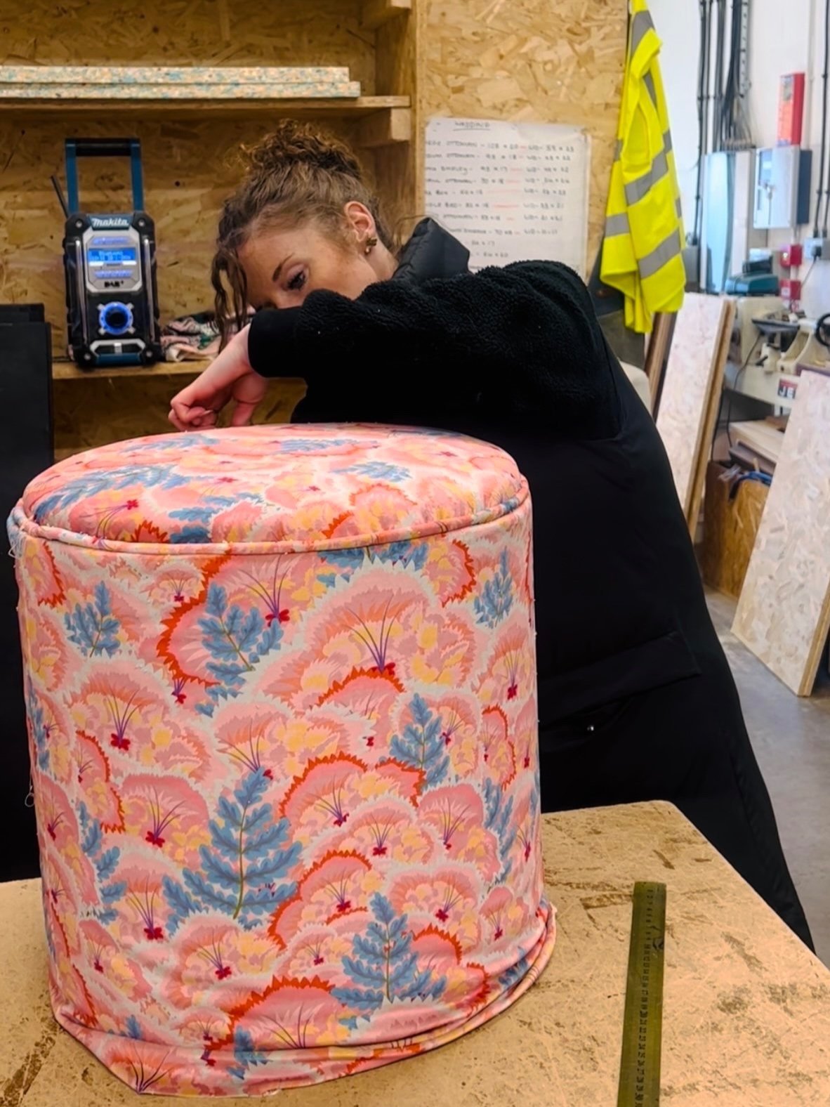
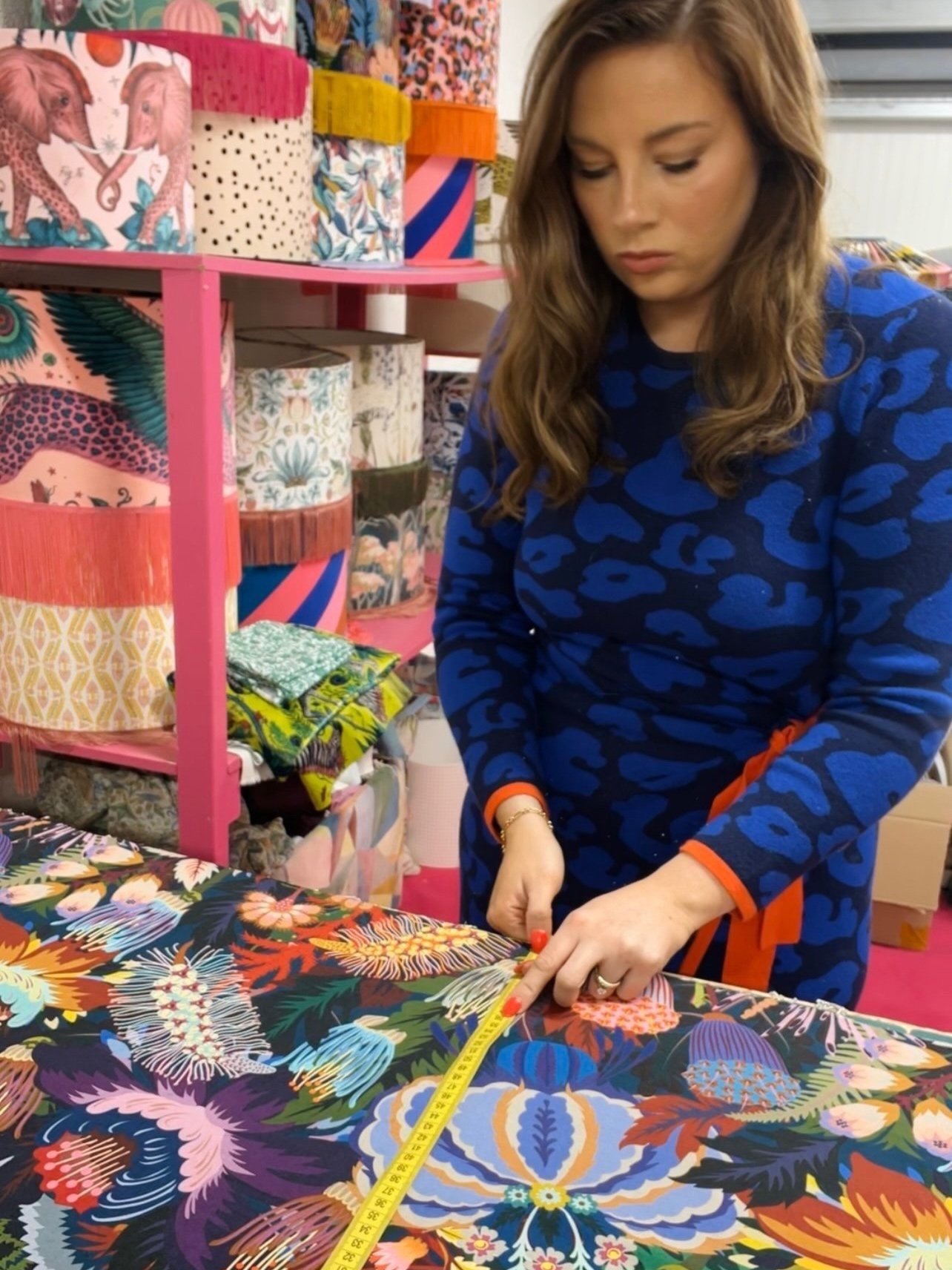
Everything is handmade by our small team of 3 in our Somerset workshop, it has been a dream for us to see Natasha’s beautiful designs come to life on our furniture and we absolutely love working on your orders.
3. The Photoshoot
Natasha very kindly made the long drive from Hove down to our workshop in Somerton, Somerset to photograph the new collection with us! The ambition for the shoot was to achieve nice clean individual shots for each piece, allowing to focus to be on the beautiful colours and details of the furniture. Natasha had the fabulous idea of creating a designated photography area in our workshop, we’re not sure why we hadn’t thought of this sooner, but we are so glad we made it happen as it has been an invaluable little asset to our studio!
With help from my husband Ed who is a carpenter, we created a backdrop from MDF and added skirting and panelling details to add interest to the back wall. We wanted the space to be bright and airy to allow our furniture to pop, so we kept things simple with a white emulsion to cover the wall and flooring.
A Few Tips For Achieving Clean Photos
Lighting makes ALL the difference!
Fortunately we were lucky with the weather on the day of our shoot, we were able to open up the shutter doors to the unit and allow the natural light to flood in. However if you don’t have much natural light in your space, I couldn’t recommend studio lights more! They don’t need to be expensive, we sourced some cheaply on Amazon and they worked perfectly for the job - it’s definitely worth investing in some good lighting.
2. Go crazy with the angles!
I don’t think there is such thing as taking too many photos! In my opinion it is better to take lots of photos of each product from different angles, when you upload these to your computer it’s good to have options that you can filter through and pick out the best ones.
We experimented with lots of different angles and compositions so we had diversity in our final photographs, this was essential for marketing materials as it kept things fresh and interesting.
3. Spend time on your backdrop
As mentioned above, achieving a clean backdrop can help take your shoot to the next level. This doesn’t need to be a costly project, we managed to pick up the materials cheaply and the set we achieved was perfect for what we wanted. However you could make things even simpler if you are limited on space, good quality photography backdrops on a frame can be sourced for under £70.00. These are made from vinyl and the rolls can be switched up from white to different patterns such as brick, this is a great solution if you need to be able to pack down your space in between shoots.
For smaller projects, thick cardboard can be sourced cheaply from any craft store and having a plain background really helps bring the focus on your product. You could pick up multiple different coloured cards to switch things up for different seasons and events throughout the year, e.g. pastels for Spring/Easter! Why not try using patterned wallpapers to mix things up a bit!
4. Have fun with it!
There is only one thing that will make your photos even better and that is you having fun and loving what you do! Your customers will love to see the joy your passion brings you!
Both Natasha and our team at Sparrow & Plumb encourage you to embrace more colour and pattern into your home, to inspire and bring you happiness - we hope this collection brings you as much joy as it has brought us! 💖
Discover the full collection here and keep an eye out for another Sparrow & Plumb x Studio Coverdale collaboration coming to you very soon…
If you have any questions on any of our products then please just pop us an email at info@sparrowandplumb.com. Don’t forget to also tag us on Instagram with your photos @sparrowandplumbhome, we always love to see how our products have been styled.
Love,


